We still use the savings dataset as an example again:
> savings <- read.table("savings.data") # read the data into R
> g <- lm(sav ~ p15 + p75 + inc + gro, data=savings) # fit the model with sav as the response and the rest variables as predictors
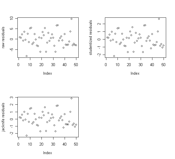
Let's plot
raw residuals,
studentized residuals, and
jacknife residuals,
and check if their relative magnitudes are different or similar.
> rstud <- rstandard(g) # studentized
residuals
> rjack <- rstudent(g) # jacknife residuals
>
par(mfrow=c(2,2)) # split the graphic window into 2x2
subwindows
> plot(g$res,ylab="raw residuals"); plot(rstud,ylab="studentized residuals"); plot(rjack,ylab="jacknife residuals") # draw raw, studentized, jacknife residuals against index
The patterns of the three residual plots look similar.
Therefore, I decide to use the raw residuals in the following analysis.
First, the residuals vs. fitted plot and the abs(residuals) vs. fitted plot.
> par(mfrow=c(1,2)) # split the graphic window into 1x2 subwindows
> plot(g$fit, g$res, xlab="Fitted", ylab="Residuals");
abline(h=0) # draw the plot of residuals against
y-hat
>
plot(g$fit,abs(g$res),xlab="Fitted",ylab="|Residuals|") # draw the plot of absolute residual
againt y-hat
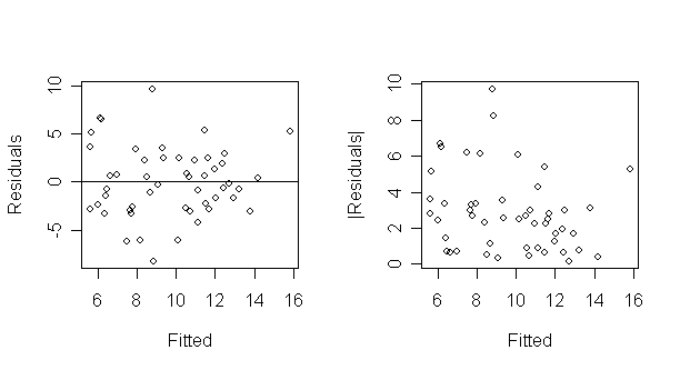
What do you see?
The latter plot is designed to check for non-constant variance only.
It folds over the bottom half of the first plot to increase the resolution for detecting non-constant variance.
A quick way to check non-constant variance is this regression:
> summary(lm(abs(g$res) ~ g$fit)) # fit a model with absolute residual as response and y-hat as predictor
Coefficients:
Estimate Std. Error t value Pr(>|t|)
(Intercept) 4.8397 1.1865 4.079 0.000170 ***
g$fit
-0.2035
0.1185 -1.717 0.092506
.
---
Signif. codes: 0 `***' 0.001 `**' 0.01 `*' 0.05 `.' 0.1
` ' 1
Residual standard error: 2.163
on 48 degrees of freedom
Multiple R-Squared:
0.05784, Adjusted
R-squared: 0.03821
F-statistic:
2.947 on 1 and 48 DF, p-value:
0.0925
> abline(summary(lm(abs(g$res) ~ g$fit))) # add the fitted line to the absolute residual plot
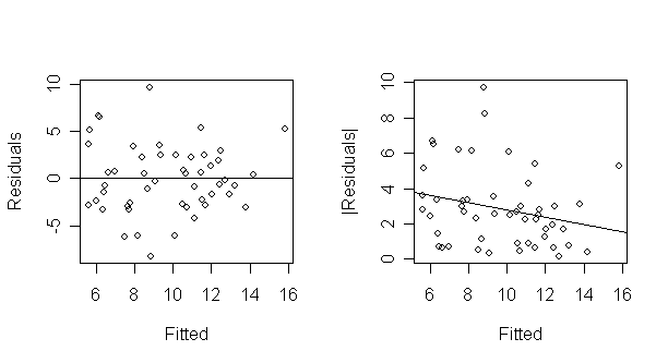
This test is not quite right as some weighting should be used and the degrees of freedom should be adjusted but there doesn't seem to be a clear problem with non-constant variance.
The former plot is still needed because non-linearity must be checked.
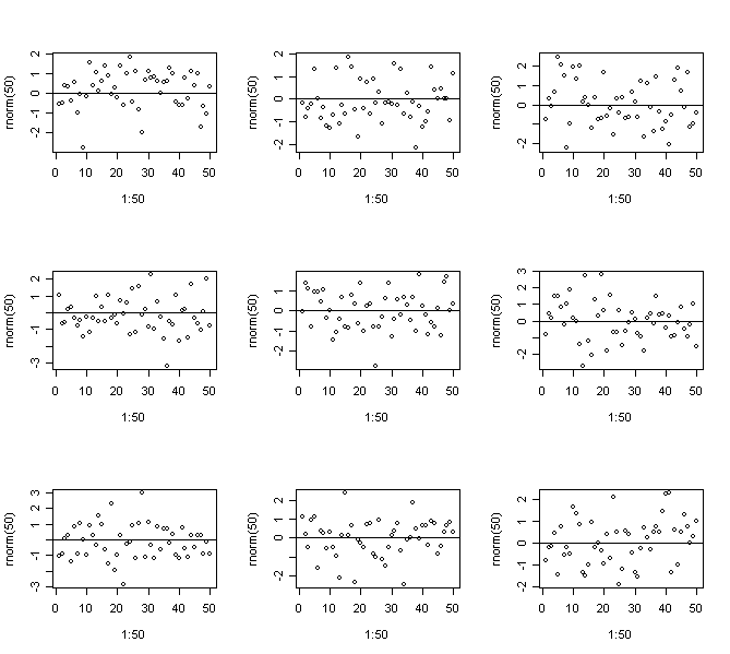
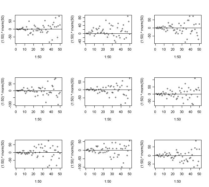
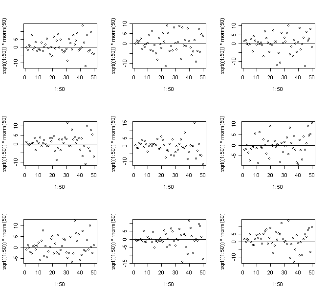
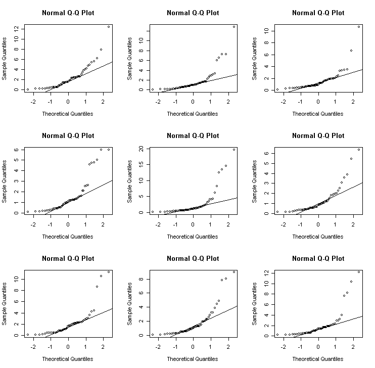
It's often had to judge residual plots without prior experience so let's generate some of the artificial variety. The following four panels show
Constant Variance
Strong non-constant variance
Mild non-constant variance
Non-linearity
> par(mfrow=c(3,3)) # split the graphic window into 2x2
subwindows
> for(i in 1:9)
{plot(1:50,rnorm(50)); abline(h=0)} # Constant Variance
> for(i in 1:9) {plot(1:50,(1:50)*rnorm(50)); abline(h=0)} # Strong non-constant variance
> for(i in 1:9) {plot(1:50,sqrt((1:50))*rnorm(50)); abline(h=0)} # Mild non-constant variance
> for(i in 1:9) {plot(1:50,cos((1:50)*pi/25)+rnorm(50)); abline(h=0)} # Non-linearity
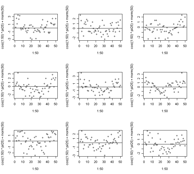
In this case we know the truth - do you think you would be able to come to the right conclusions for real data?
Repeat to get an idea of the usual amount of variation.
It's recommended to use the artificial generation of plots as a way to "calibrate" diagnostic plots. It's often hard to judge whether an apparent feature is real or just random variation. Repeated generation of plots under a model where there is no violation of the assumption that the diagnostic plot is designed to check is helpful in making this judgment.
Now let's go back to saving data, and look at the residuals against predictor plots:
> par(mfrow=c(2,3)) # split the graphic window into 2x3 subwindows
>
plot(savings$p15,g$res,xlab="pop15",ylab="residuals"); abline(h=0) # residual plot - residual against
predictor p15
>
plot(savings$p75,g$res,xlab="pop75",ylab="residuals"); abline(h=0) # residual plot - residual against
predictor p75
>
plot(savings$inc,g$res,xlab="income",ylab="residuals"); abline(h=0) # residual plot - residual against
predictor inc
>
plot(savings$gro,g$res,xlab="growth",ylab="residuals"); abline(h=0) # residual plot - residual
against predictor gro
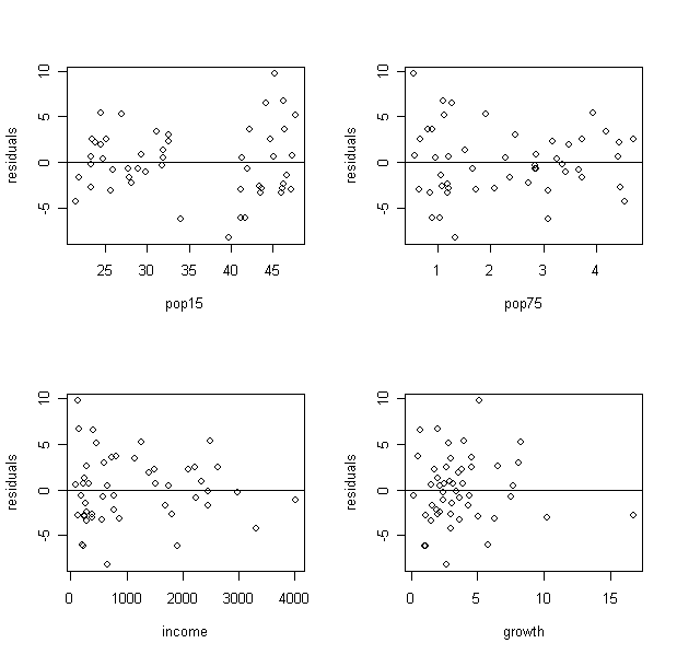
What did you find from the plot of residuals against p15? Can you see the two groups?
You can compare and test the variance. (Given two independent samples from normal distributions, we can test for equal variance using the test statistics of the ratio of the two variance. The null distribution is a F with degrees of freedom given by the two samples. Try to implement the test by yourself).
What remedy will you suggest?
From the plot of residuals against income, what can you find?
It seems the variance decrease when income increase. Let's further explore it:
> par(mfrow=c(1,1))
> plot(savings$inc, g$res, xlab="income", ylab="residuals", type="n") # draw a "no plotting" plot of residual against income
> points(savings$inc[savings$p15 <35], g$res[savings$p15 <35], pch=1) # label the points with p15<35 as circles
> points(savings$inc[savings$p15 >35], g$res[savings$p15 >35], pch=4) # label the points with p15>35 as cross
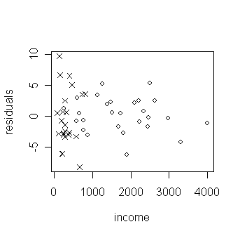
How is the decrease of variance related to the two groups of low and high p15?
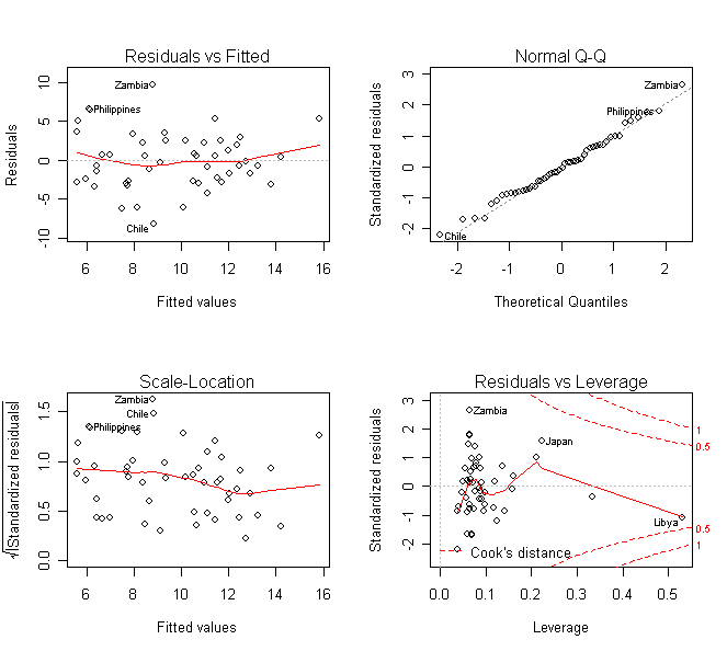
A quick way to get various diagnostic plots for the regression is:
> par(mfrow=c(2,2)); plot(g) # some default diagnostic plots in R
Consider the residual vs. fitted plot for the Galapagos data in previous lab.
> gala <- read.table("gala.data") # read the data into R
> gg <- lm(Species~Area+Elevation+Scruz+Nearest+Adjacent, data=gala) # fit a model with Species as response and other variables as predictors
> plot(gg$fit,gg$res,xlab="Fitted",ylab="Residuals",main="untransformed response") # draw the plot of residual against y-hat
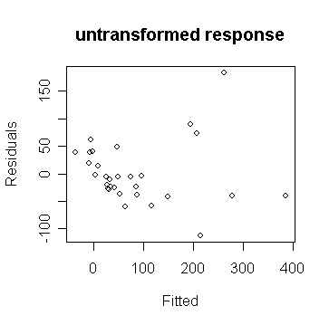
We can observe non-constant variance in the plot.
From the shape, we guess that a square root transformation (why?) will give us constant variance:
> gs <-
lm(sqrt(Species)~Area+Elevation+Scruz+Nearest+Adjacent, data=gala)
# fit a model with square root of Species as response and
other variables as predictors
>
plot(gs$fit, gs$res, xlab="Fitted", ylab="Residuals",main="square root
response")
# draw the plot of residual against y-hat
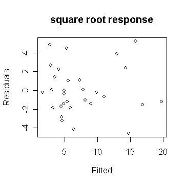
We see that in the 2nd plot, the variance is now constant.
Our guess at a variance stabilizing transformation worked out here. But, if it's not, we can always try something else.
The square root transformation is often appropriate for count response data. The Poisson distribution is a good model for counts and that distribution has the property that the mean is equal to the variance, thus suggesting the square root transformation. However, it might be even better to go with a Poisson regression rather than the normal-based regression we are using here.
We use the savings dataset as an example again.
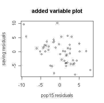
First we construct a added variable plot for p15:
> d <- lm(sav ~ p75 + inc + gro,
data=savings)$res # calculate the residual of the model
with sav as response and p75, inc, gro as predictors
> m <- lm(p15 ~ p75 + inc + gro,
data=savings)$res # calculate the residual of the model
with p15 as response and p75, inc, gro as predictors
> plot(m, d, xlab="pop15 residuals", ylab="saving
residuals", main="added variable plot")
# draw the 1st residuals against the
2nd residuals
Compare the slope on the plot to the original regression and show the line on the plot:
> lm(d ~ m)$coef # get the intercept and slope of the fitted line with 1st residual as response and 2nd residual as predictor
(Intercept)
m
-1.231709e-16
-0.461205
> g$coef # the coefficients of the fitted model with sav as the response and the other variables as predictors
(Intercept)
p15
p75
inc gro
28.56661
-0.461205 -1.691576 -0.0003367615 0.4096998
> abline(0,g$coef['p15']) # add the fitted line to the plot
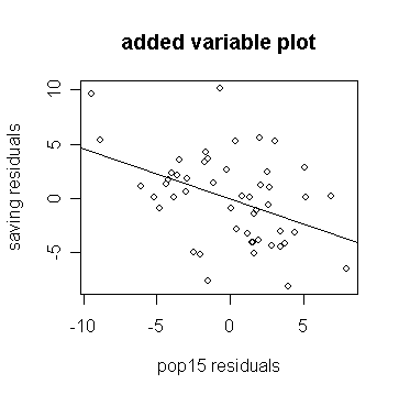
Notice how the slope in the plot and the slope for p15 in the regression fit are the same.
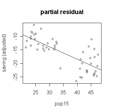
A partial residual plot is easier to do:
> plot(savings$p15, g$res+g$coef['p15']*savings$p15,
xlab="pop15", ylab="saving (adjusted)", main="partial residual") # draw the partial residual plot for
p15
>
abline(0, g$coef['p15']) # add the fitted line to the plot
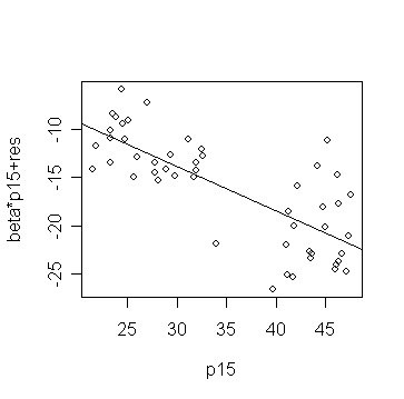
or more directly, you can use the function:
> prplot(g,1)
Might there be a different relationship in the two groups:
> g1 <- lm(sav ~ p15 + p75 + inc + gro, subset=(p15
> 35), data=savings) # fit a model for data with p15>35
> g2 <- lm(sav ~ p15 + p75 + inc + gro,
subset=(p15 < 35), data=savings) # fit a model for data with p15<35
> summary(g1) #
take a look of the fitted model g1
Coefficients:
Estimate Std. Error t value Pr(>|t|)
(Intercept) -2.4339689
21.1550278 -0.115 0.910
p15
0.2738537 0.4391910 0.624 0.541
p75
-3.5484769 3.0332806 -1.170 0.257
inc
0.0004208 0.0050001 0.084 0.934
gro
0.3954742 0.2901012 1.363 0.190
Residual standard error: 4.454
on 18 degrees of freedom
Multiple R-Squared:
0.1558, Adjusted
R-squared: -0.03185
F-statistic: 0.8302 on 4 and 18
DF, p-value: 0.5233
> summary(g2) # take a look of the fitted model g2
Coefficients:
Estimate
Std. Error t value Pr(>|t|)
(Intercept) 23.9637508 8.0836079 2.964 0.00716 **
p15
-0.3859519 0.1953668 -1.976 0.06089 .
p75
-1.3278580 0.9260337 -1.434 0.16566
inc
-0.0004587 0.0007237 -0.634 0.53271
gro
0.8843841 0.2953329 2.995 0.00668 **
---
Signif. codes: 0 `***' 0.001 `**' 0.01 `*' 0.05 `.' 0.1
` ' 1
Residual standard error: 2.772 on 22 degrees
of freedom
Multiple R-Squared: 0.5073, Adjusted R-squared:
0.4177
F-statistic: 5.663 on 4 and 22 DF, p-value: 0.002733
Can you see the difference? Pay attention to the estimated coefficients of p15 and interpret the difference.
The graphical analysis has shown a relationship in the data that a purely numerical analysis might easily have missed.
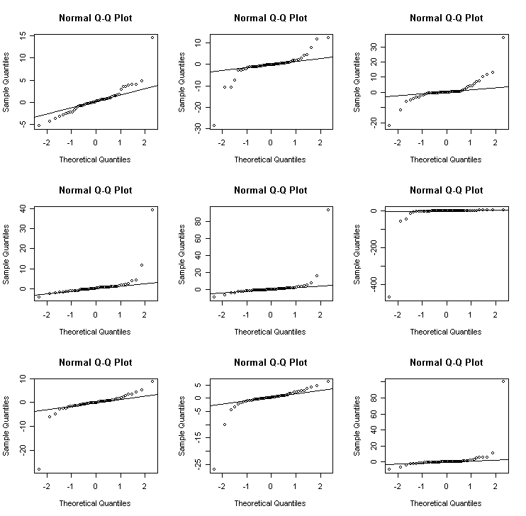
Q-Q plots
Q-Q plots can be used to check the assumptions of normality.
Let's try it out on the same saving data:
> par(mfrow=c(2,2)) # split the graphic window into 2x2 subwindows
> qqnorm(g$res, ylab="raw residuals") # draw the normal probability plot for
raw residuals
>
qqline(g$res) # add a straight line to guide the
examination
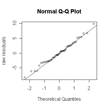
Looks fine - the command "qqline" adds a line joining the first and third quartiles - it's useful as a guide.
We can plot the studentized residuals:
> qqnorm(rstud, ylab="studentized residuals") # draw the normal probability plot for
studentized residuals
>
abline(0,1) # add the
straight line with zero intercept and solpe=1
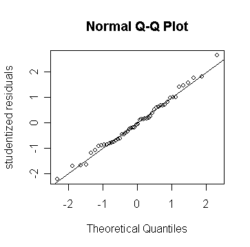
Because these residuals have been normalized, they should lie along a 45 degree line.
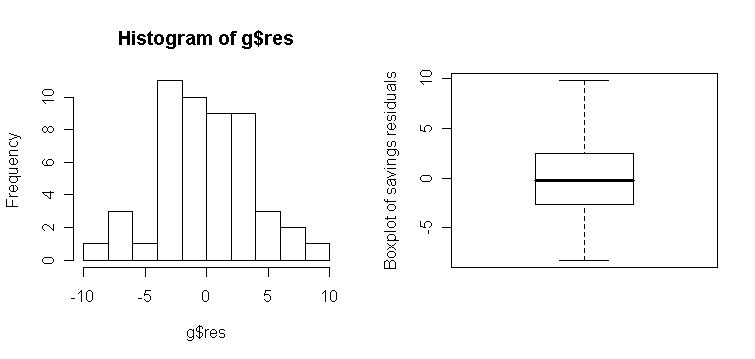
Note that histograms and box-plots are not as sensitive for checking normality:
> par(mfrow=c(1, 2)) # split the graphic window into 1x2 subwindows
> hist(g$res, 10) # a histogram plot for raw residuals
> boxplot(g$res, ylab="Boxplot
of savings residuals") # a
box-plot for raw residuals
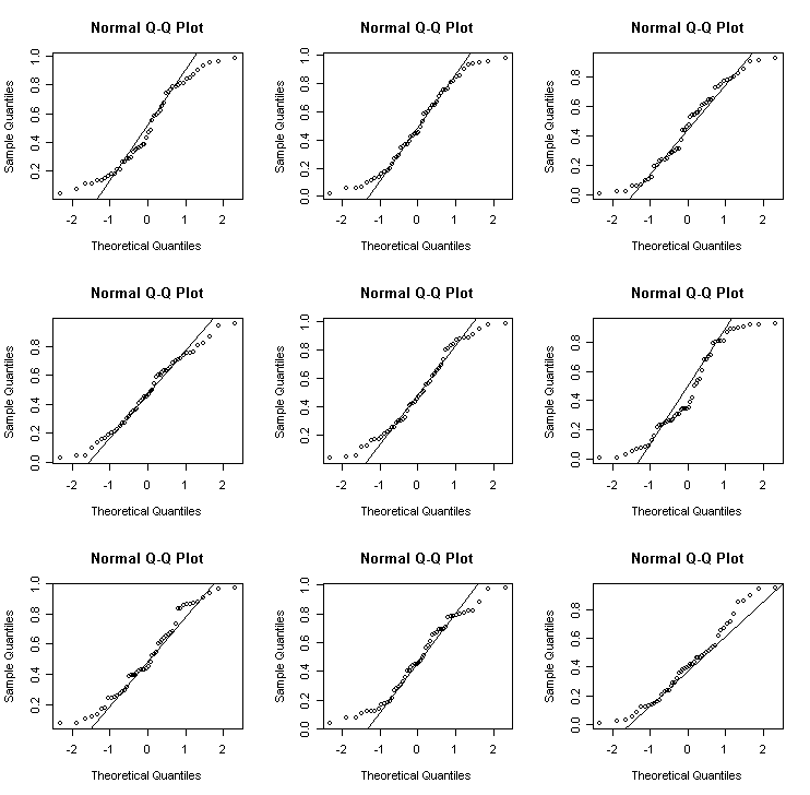
We can get an idea of the variation to be expected in Q-Q plots in the following experiment. I generate data from different distributions:
Normal
Lognormal - an example of a skewed distribution
Cauchy - an example of a long-tailed (platykurtic) distribution
Uniform - an example of a short-tailed (leptokurtic) distribution
> par(mfrow=c(3,3)) # split the graphic window into 3x3
subwindows
> for(i in 1:9)
{x<-rnorm(50); qqnorm(x); qqline(x)} # normal
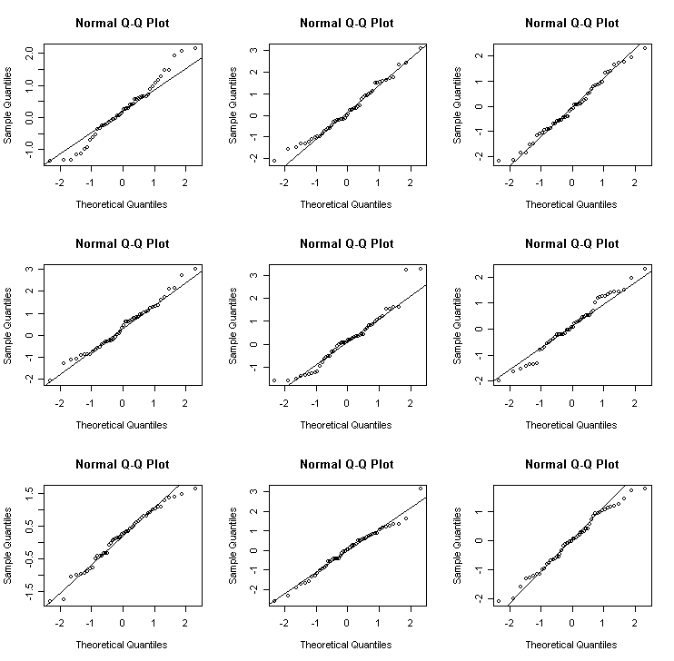
> for(i in 1:9) {x<-exp(rnorm(50)); qqnorm(x); qqline(x)} # lognormal
> for(i in 1:9) {x<-rcauchy(50); qqnorm(x); qqline(x)} # Cauchy
> for(i in 1:9) {x<-runif(50); qqnorm(x); qqline(x)} # uniform
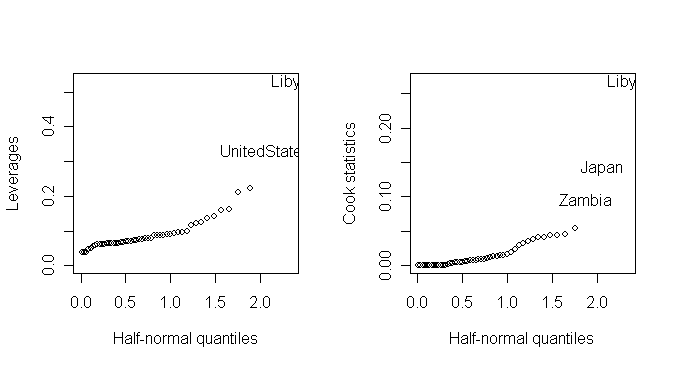
Half-normal plot
Half-normal plot is often used to look for extreme values which will be apparent as points that diverge substantially from the rest of the data.
We demonstrate the half-normal plot on the leverages and Cook statistics for the saving data. Here is a function for half-normal plot.
> par(mfrow=c(1,2)); countries <- row.names(savings)
> halfnorm(lm.influence(g)$hat, labs=countries, ylab="Leverages") # draw half-normal plot for leverage
> halfnorm(cooks.distance(g), labs=countries, nlab=3, ylab="Cook statistics") # draw half-normal plot for Cook's statistics
Correlated errors
One of the important assumptions used when fitting the standard linear model is that the errors are uncorrelated.
When the observations have been collected over time, it is sensible to check for serial correlation.
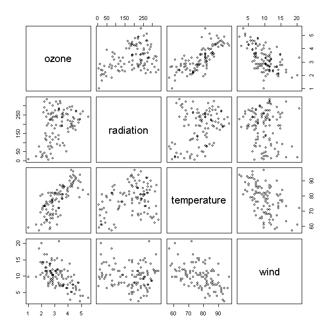
For the example, we use the data taken from an environmental study that measured the four variables
ozone,
solar radiation,
temperature, and
wind speed
for 111 consecutive days.
> air <- read.table("air.data",header=T) # read the data into R
> air # take a look of the data
ozone radiation temperature wind
1 3.448217 190 67 7.4
2 3.301927 118 72 8.0
...deleted...
111 2.714418 223 68 11.5
Take a look of the scatter plots of variables in the data set:
> pairs(air) # draw pair-wise scatter plots
We fit a linear model:
> ga <- lm(ozone ~ radiation + temperature + wind,
data=air) # fit the model with ozone as response
and other variables as predictors
> summary(ga)
# take a look of the fitted model
Call:
lm(formula = ozone ~ radiation + temperature + wind, data = air)
Residuals:
Min 1Q Median 3Q Max
-1.12160 -0.37635 -0.02535 0.33607 1.49514
Coefficients:
Estimate Std. Error t value Pr(>|t|)
(Intercept) -0.2973296 0.5552139 -0.536 0.593400
radiation 0.0022055 0.0005585 3.949 0.000141 ***
temperature 0.0500443 0.0061062 8.196 5.85e-13 ***
wind -0.0760219 0.0157548 -4.825 4.67e-06 ***
---
Signif. codes: 0 '***' 0.001 '**' 0.01 '*' 0.05 '.' 0.1 ' ' 1
Residual standard error: 0.5102 on 107 degrees of freedom
Multiple R-Squared: 0.6807, Adjusted R-squared: 0.6717
F-statistic: 76.03 on 3 and 107 DF, p-value: < 2.2e-16
Check some diagnostics:
> par(mfrow=c(2, 2)); plot(ga) # draw the default diagnostics plots
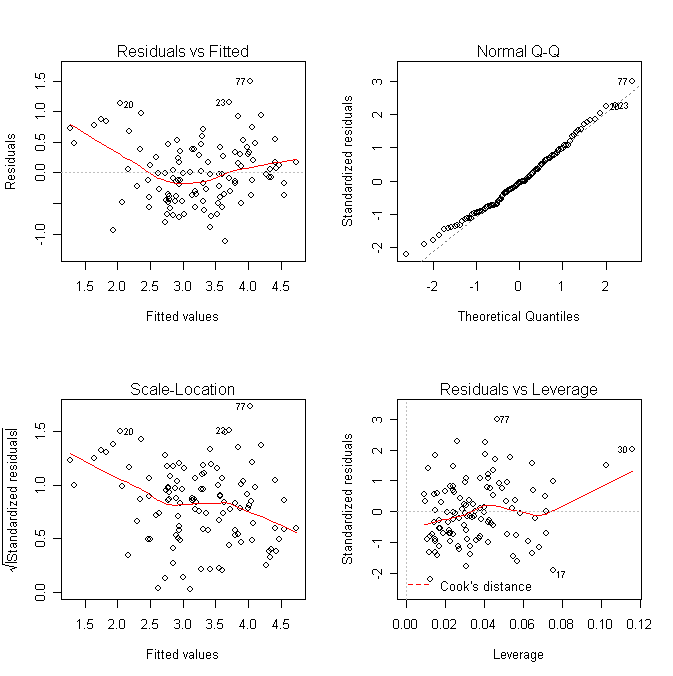
What does the plot of residual against y-hat suggest? Do we need to transform the response?
Suppose we are otherwise satisfied with this model and want to check for serial correlation. First make an index plot of the residuals (note index represents time in this case):
> plot(ga$res) # draw the plot of residual against index
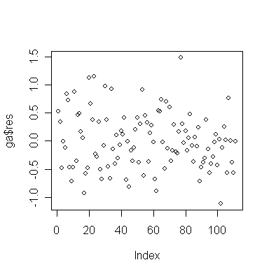
Is there any evidence of serial correlation?
Now plot successive residuals:
> plot(ga$res[-111],ga$res[-1]) # plot εt-hat against εt+1-hat
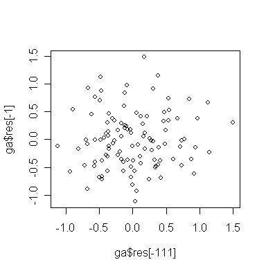
Do you see any problem?
You can plot more than just successive pairs:
> pairs(cbind(ga$res[-c(109,110,111)], ga$res[-c(1,110,111)], ga$res[-c(1,2,111)], ga$res[-c(1,2,3)]),labels=c("res","lag1 res","lag2 res","lag3 res")) # plot εt-hat against εt+1-hat, εt+2-hat, εt+3-hat
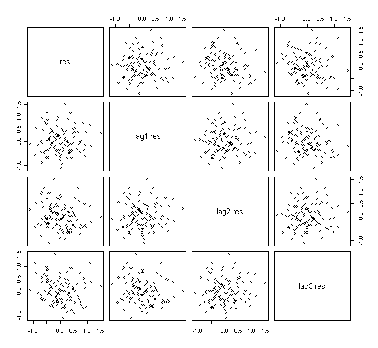
Do you see that some plots are almost identical? Why?
We can compute the Durbin-Watson statistic:
> library(lmtest) # load the "lmtest" library into R
> dwtest(ozone ~ radiation + temperature + wind, data=air) # perform the D-W test
Durbin-Watson test
data: ozone ~ radiation + temperature + wind
DW = 1.8501, p-value = 0.1893
alternative hypothesis: true autocorrelation is greater than 0
The p-value indicates no evidence of correlation and note that the D-W statistic is close to 2.