This is a critical step that should always be performed. You should
understand the background of a dataset and what each variables in the dataset represent.
calculate some descriptive statistics, such as means, standard deviation, maximum and minimum, correlation, and whatever else is appropriate.
draw graphical summaries, such as histograms, box plots, density plots, scatter plots, and many more.
In these numerical and graphical summaries, you can look for
outliers,
data-entry errors,
skewed or unusual distributions and structure,
and check
whether the data are distributed according to prior expectations and
whether some assumptions in the models that will be conducted in further data analyses are violated.
Here is a data set from a study conducted by the National Institute of Diabetes and Digestive and Kidney Diseases on 768 adult female Pima Indians living near Phoenix. We start by reading the data into R.
> pima <- read.table("pima.data", header=T)
# read the data into R
> pima # take a look
pregnant glucose blood triceps insulin
bmi pedigree age test
1 6
148 72 35
0 33.6 0.627 50 1
2 1
85 66 29
0 26.6 0.351 31 0
3 8
183 64 0
0 23.3 0.672 32 1
... much deleted ...
768 1
93 70 31
0 30.4 0.315 23 0
The variables represents:
| pregnant | the number times pregnant |
| glucose | the plasma glucose concentration at 2 hours in an oral glucose tolerance test |
| blood | the diastolic blood pressure (mmHg) |
| triceps | the triceps skin fold thickness (mm) |
| insulin | the 2-hour serum insulin (mu U/ml) |
| bmi | the body mass index (weight in kg/(height in m2)) |
| pedigree | the diabetes pedigree function |
| age | the age (years) |
| test | whether the patient showed signs of diabetes (0=negative, 1=positive) |
(Q: Are these variable quantitative or qualitative? If quantitative, continuous or discrete? If qualitative, whether order exists between levels)
At this stage, we are looking for anything unusual or unexpected, say indication of a data-entry error, or anything that show inconsistency with the pre-knowledge about the data. Let's first calculate some numerical summaries.
> summary(pima) # some numerical summaries
pregnant glucose blood triceps
Min. : 0.000 Min. : 0.0 Min. : 0.0 Min. : 0.00
1st Qu.: 1.000 1st Qu.: 99.0 1st Qu.: 62.0 1st Qu.: 0.00
Median : 3.000 Median :117.0 Median : 72.0 Median :23.00
Mean : 3.845 Mean :120.9 Mean : 69.1 Mean :20.54
3rd Qu.: 6.000 3rd Qu.:140.3 3rd Qu.: 80.0 3rd Qu.:32.00
Max. :17.000 Max. :199.0 Max. :122.0 Max. :99.00
insulin bmi pedigree age
Min. : 0.0 Min. : 0.00 Min. :0.0780 Min. :21.00
1st Qu.: 0.0 1st Qu.:27.30 1st Qu.:0.2437 1st Qu.:24.00
Median : 30.5 Median :32.00 Median :0.3725 Median :29.00
Mean : 79.8 Mean :31.99 Mean :0.4719 Mean :33.24
3rd Qu.:127.3 3rd Qu.:36.60 3rd Qu.:0.6262 3rd Qu.:41.00
Max. :846.0 Max. :67.10 Max. :2.4200 Max. :81.00
test
Min. :0.0000
1st Qu.:0.0000
Median :0.0000
Mean :0.3490
3rd Qu.:1.0000
Max. :1.0000
Take a close look at the minimum and maximum values of each variable. What have you found?
It is weird that blood pressure equals zero (also check variables glucose, triceps, insulin, bmi). Let's check their sorted values to find out how many 0's in the variable blood.
> sort(pima$blood) # sort the values of this variable from small to large
[1] 0 0 0 0 0 0 0 0 0 0 0 0 0 0 0 0 0 0
[19] 0 0 0 0 0 0 0 0 0 0 0 0 0 0 0 0 0 24
[37] 30 30 38 40 44 44 44 44 46 46 48 48 48 48 48 50 50 50
... much deleted ...
[739] 94 94 94 94 94 94 95 96 96 96 96 98 98 98 100 100 100 102
[757] 104 104 106 106 106 108 108 110 110 110 114 122
It seems likely that the zero has been used as a missing value code. In a real investigation, one would likely be able to question what really happened and if missing, whether there exists a systematic missing mechanism.
R use "NA" as the missing value code. Let's
set all zero values of the variables to NA.
> pima$blood[pima$blood == 0] <- NA
# set zero values in the variable blood to
"NA", where "==" means "equal" in R
> pima$glucose[pima$glucose == 0] <- NA
# set zero values in the variable glucose to
"NA"
> pima$triceps[pima$triceps == 0] <- NA
# set zero values in the variable triceps to
"NA"
> pima$insulin[pima$insulin == 0] <- NA
# set zero values in the variable insulin to
"NA"
> pima$bmi[pima$bmi == 0] <- NA
# set zero values in the variable bmi to "NA"
The variable test is a qualitative variable, whose numerical coding is meaningless. In R, a qualitative variable should be assigned as a "factor" so that R can handle it in an appropriate way.
> pima$test <- factor(pima$test) # assign the variable test as a factor in R
> summary(pima$test) # take a look
0 1
500 268
It is even better to use descriptive labels:
> levels(pima$test) # check how variable test is coded now
[1] "0" "1"
> levels(pima$test) <- c("negative", "positive") # assign descriptive labels to variable test
> levels(pima$test) # check how variable test is coded now
[1] "negative" "positive"
Now, let's take a look of the summary of the dataset again.
> summary(pima) # take a look
pregnant glucose blood triceps
Min. : 0.000 Min. : 44.0 Min. : 24.0 Min. : 7.00
1st Qu.: 1.000 1st Qu.: 99.0 1st Qu.: 64.0 1st Qu.: 22.00
Median : 3.000 Median :117.0 Median : 72.0 Median : 29.00
Mean : 3.845 Mean :121.7 Mean : 72.4 Mean : 29.15
3rd Qu.: 6.000 3rd Qu.:141.0 3rd Qu.: 80.0 3rd Qu.: 36.00
Max. :17.000 Max. :199.0 Max. :122.0 Max. : 99.00
NA's : 5.0 NA's : 35.0 NA's :227.00
insulin bmi pedigree age
Min. : 14.00 Min. : 0.00 Min. :0.0780 Min. :21.00
1st Qu.: 76.25 1st Qu.:27.30 1st Qu.:0.2437 1st Qu.:24.00
Median :125.00 Median :32.00 Median :0.3725 Median :29.00
Mean :155.55 Mean :31.99 Mean :0.4719 Mean :33.24
3rd Qu.:190.00 3rd Qu.:36.60 3rd Qu.:0.6262 3rd Qu.:41.00
Max. :846.00 Max. :67.10 Max. :2.4200 Max. :81.00
NA's :374.00
test
negative:500
positive:268
Try to compare it with the previous summary and see how the results are different.
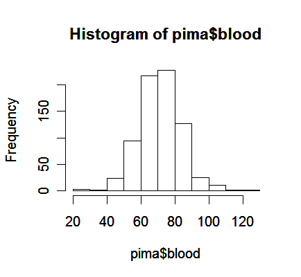
Now we can do some plots to examine the distribution of variables. Use the variable blood as an example.
> hist(pima$blood) # draw histogram of variable blood
From the plot,
We see a bell-shaped distribution for the blood pressures centered around 70.
Notice that histogram plot may obscure some features of the data because its construction requires some inputs specified by the user, such as the spacing on the horizontal axis.
For this reason, a smoothed version of the histogram might be preferred.
> plot(density(pima$blood, na.rm=TRUE)) # the function "density" computes kernel density estimates, "na.rm=True" option removes missing values.
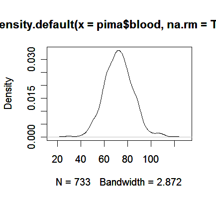
We see the plot avoids the distracting blocks in the histogram.
Another alternative is to plot the sorted data against its index.
> plot(sort(pima$blood), pch=".")
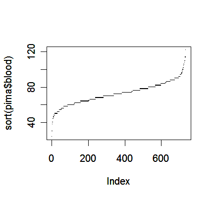
One advantage of this plot is that we can see all the cases individually, which may offer some information about outliers in addition to the distribution of data.
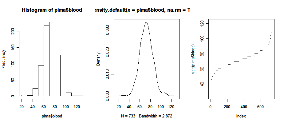
We can draw the three plots in a window for a better comperison:
> par(mfrow = c(1, 3)) # the graphical parameter "mfrow" is a 2-dim vectors in which the first number assigns the number of rows, the second the number of columns; try the command "help(par)" to get more information on graphical parameters
> hist(pima$blood); plot(density(pima$blood, na.rm=TRUE)); plot(sort(pima$blood), pch=".")
> par(mfrow = c(1, 1)) # set the parameter back to itsoriginal setting
Now, note a couple of bi-variate plots.
> par(mfrow = c(1, 2))
> plot(pedigree ~ blood, pima)
# the command draws a scatter plot because the variable
blood is a quantitative variable
> plot(pedigree ~ test, pima)
# it draws a side-by-side box plot because the variable
test is a qualitative variable
> par(mfrow = c(1,1))
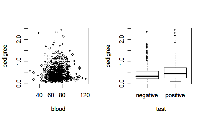
Notice that
the scatter plot (left panel) shows the relationship between two quantitative variables,
the side-by-side boxplot (right panel) is suitable for showing how the distribution of a quantitative variable is influenced by a qualitative variable.
Also useful is a scatter plot matrix.
> pairs(pima) # produce a matrix of scatter plots
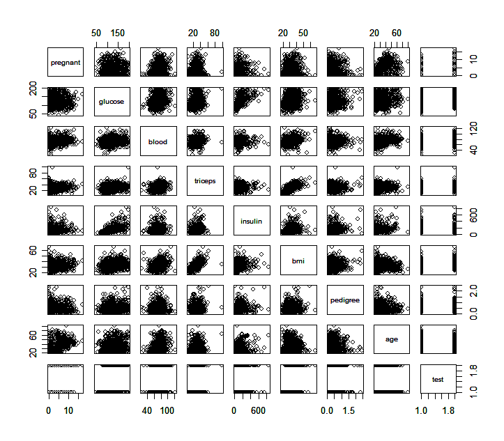
What information can you find from these scatter plots? Are there some plots that particularly catch you attention?